[Css: Padding, Margin Y Border: Guía Definitiva]
Executive Summary
This definitive guide dives deep into the often-confusing world of CSS padding, margin, and border. We’ll demystify these crucial styling properties, explaining their differences, how they interact, and how to effectively utilize them to create visually appealing and well-structured web pages. This guide is designed for both beginners struggling to grasp the fundamentals and experienced developers seeking to refine their CSS skills. We’ll cover practical examples and offer clear explanations to solidify your understanding and help you master these essential CSS concepts. Prepare to conquer your CSS layout challenges!
Introduction
Understanding CSS padding, margin, and border is fundamental to building visually appealing and well-structured websites. These three properties control the space around and within HTML elements, directly impacting the layout and overall design. While often used interchangeably, they possess distinct functionalities and mastering their differences is key to creating professional-looking web pages. This guide will clarify these distinctions, providing practical examples and best practices to elevate your CSS skills. Let’s begin our journey to CSS mastery!
FAQ
-
Q: What’s the difference between padding and margin?
- A: Padding adds space inside an element’s border, between the content and the border. Margin adds space outside the element’s border, between the element and other elements or the browser window.
-
Q: Can I use negative margins?
- A: Yes, using negative margins can be useful for creating overlapping elements or achieving specific layout effects. However, overuse can lead to unpredictable results, so use them cautiously and with a clear understanding of their impact.
-
Q: How do I apply padding, margin, and border to all four sides of an element at once?
- A: You can use shorthand notations. For example:
padding: 10px;applies 10 pixels of padding to all four sides. You can also specify individual values:padding: 10px 20px 30px 40px;(top, right, bottom, left). The same shorthand applies to margins and borders.
- A: You can use shorthand notations. For example:
Understanding Padding
Padding controls the space between an element’s content and its border. It’s internal spacing. Think of it as the “breathing room” within an element. Mastering padding is vital for creating comfortable and visually balanced designs.
-
Shorthand Notation: Use
padding: 10px;for equal padding on all sides, orpadding: 10px 20px 30px 40px;for top, right, bottom, left respectively. -
Specificity: Padding’s impact is contained within the element itself; it doesn’t affect the positioning of other elements.
-
Units: Padding can be specified using various units such as pixels (px), ems, rems, percentages (%), etc. Choosing the right unit depends on your layout needs and responsiveness.
-
Box Model: Padding is a crucial component of the CSS box model, which defines how an element’s content, padding, border, and margin interact.
-
Practical Application: Use padding to create visual separation between text and its container, enhance readability, or add visual space within form elements.
-
Responsiveness: Consider using percentage-based or rem units for responsive padding that adjusts to different screen sizes.
Mastering Margins
Margins control the space outside an element’s border, between the element and its neighboring elements or the browser window. They are critical for positioning and spacing elements in your layout. Effective margin usage is essential for clean and organized designs.
-
Shorthand Notation: Similar to padding, use shorthand
margin: 10px;ormargin: 10px 20px 30px 40px;. -
Auto Margins: Setting
margin: 0 auto;on a block-level element centers it horizontally. -
Collapse: Adjacent margins of block-level elements can collapse, resulting in a single margin that’s the larger of the two. Understanding this is crucial for precise layout control.
-
Negative Margins: These can be useful for creating overlapping effects or precise positioning, but should be used judiciously to avoid unexpected results.
-
Practical Application: Use margins to control the spacing between paragraphs, images, or sections of your website.
-
Importance of consistency: Consistent margin values across your website lead to a more professional and visually appealing layout.
The Power of Borders
Borders form a visual boundary around an element. They add definition and structure, enhancing the visual appeal and readability of your website. Borders are surprisingly versatile and can add visual interest in unexpected ways.
-
Style, Width, and Color: Define border styles (e.g., solid, dashed, dotted), width (e.g., 1px, 2px), and color (e.g., #000, red). Shorthand notation:
border: 1px solid black;. -
Individual Sides: Set borders for individual sides (top, right, bottom, left) using
border-top,border-right,border-bottom,border-left. -
Rounded Corners: Use
border-radiusto create rounded corners for a softer look. Experiment with different values to create various degrees of roundness. -
Image Borders: Use images as borders for a unique and creative design element.
-
Practical Application: Use borders to visually separate sections, highlight important elements, or create visual dividers.
-
Responsiveness: Consider border widths that scale gracefully with screen size.
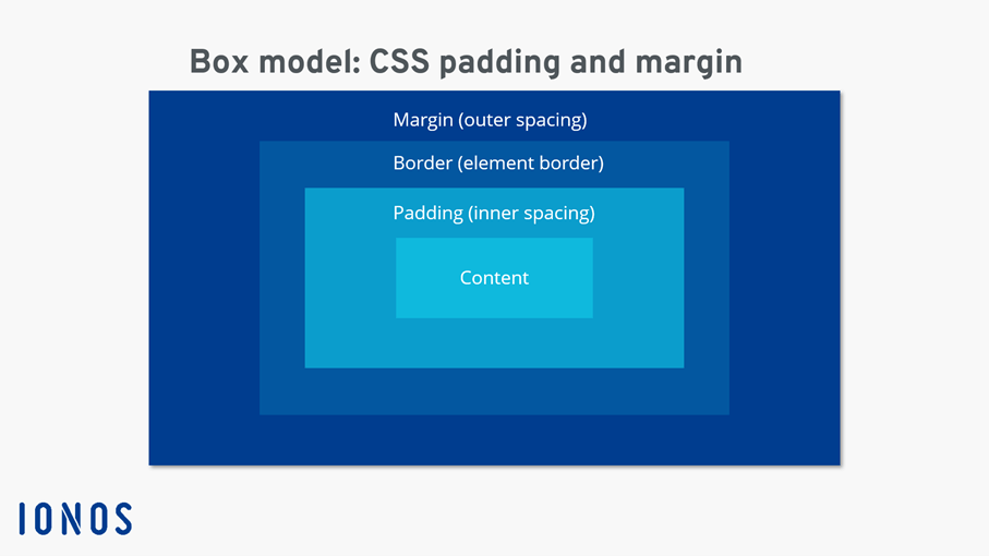
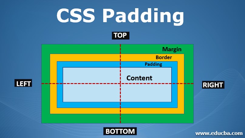
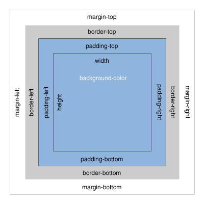
Working with the CSS Box Model
The CSS box model is a fundamental concept that describes how elements are rendered on a webpage. Understanding it fully unlocks a world of layout possibilities and helps you predict element behavior. It is the crucial underlying principle behind all of this.
-
Content: The actual content of the element (text, images, etc.).
-
Padding: The space inside the element’s border.
-
Border: The line that surrounds the element.
-
Margin: The space outside the element’s border.
Understanding the box model is crucial for accurately predicting the size and spacing of elements. Knowing how these components interact is key to avoiding layout surprises. The box model is fundamental to how elements render and interact with each other.
-
Box-Sizing Property: The
box-sizingproperty allows you to control whether the padding and border are included in the element’s total width and height. Setting it toborder-boxcan simplify layout calculations. -
Practical Application: Mastering the box model is essential for consistent and accurate website layouts.
Conclusion
This comprehensive guide has provided a thorough exploration of CSS padding, margin, and border, three fundamental properties crucial for creating well-structured and visually appealing websites. By understanding their individual functionalities, their interactions within the CSS box model, and their practical applications, you can significantly improve the quality and professionalism of your web designs. Remember the power of shorthand notation, the versatility of borders, and the importance of a consistent approach to margin and padding. Armed with this knowledge, you can confidently tackle any layout challenge and create truly impressive websites. Continue practicing and experimenting to truly master these essential CSS tools.
Keyword Tags
padding, margin, border, css box model, css layout
