[Css: Padding Vs. Margin Y Otras Propiedades]
Executive Summary
This comprehensive guide dives deep into the world of CSS box model properties, focusing specifically on the often-confused concepts of padding and margin. We’ll clarify their differences, explore their practical applications, and delve into other crucial properties like border, width, and height, demonstrating how they all work together to control the layout and appearance of your web elements. We’ll equip you with the knowledge to confidently manipulate these properties, resulting in cleaner, more efficient, and visually appealing web designs. Beyond the basics, we’ll explore advanced techniques to harness the full power of the CSS box model. Prepare to master the art of precise web design!
Introduction
CSS (Cascading Style Sheets) is the backbone of web design, allowing you to control the visual presentation of your website. A fundamental aspect of CSS is understanding the box model, which dictates how elements are positioned and sized on the page. This guide focuses on essential box model properties, particularly padding and margin, clarifying their differences and exploring their practical uses. We’ll also explore other properties and how they interrelate to achieve precise control over your website’s layout. Mastering these concepts is key to building visually stunning and functional websites.
FAQ
-
What’s the difference between padding and margin? Padding adds space inside an element’s border, affecting the element’s content. Margin adds space outside the element’s border, affecting the element’s position relative to other elements.
-
How do I use padding and margin effectively? Use padding to create space between the content and the border of an element. Use margin to control the spacing between different elements on a page. Understanding the context and using them appropriately is key.
-
Can I use negative margins? Yes, negative margins can be used to overlap elements or create interesting visual effects; however, overuse can lead to unexpected and difficult-to-debug layouts. Use them cautiously and with a thorough understanding of their impact.
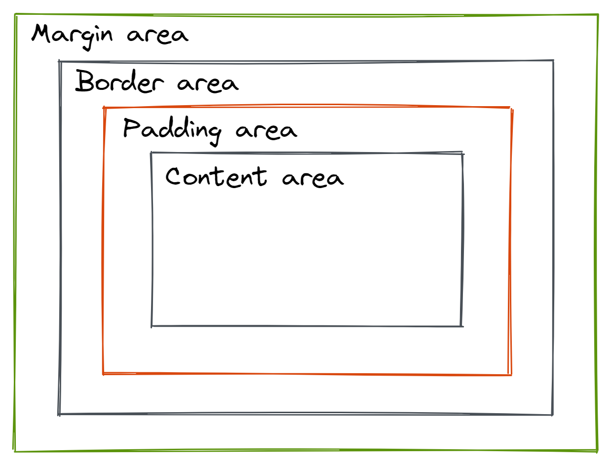
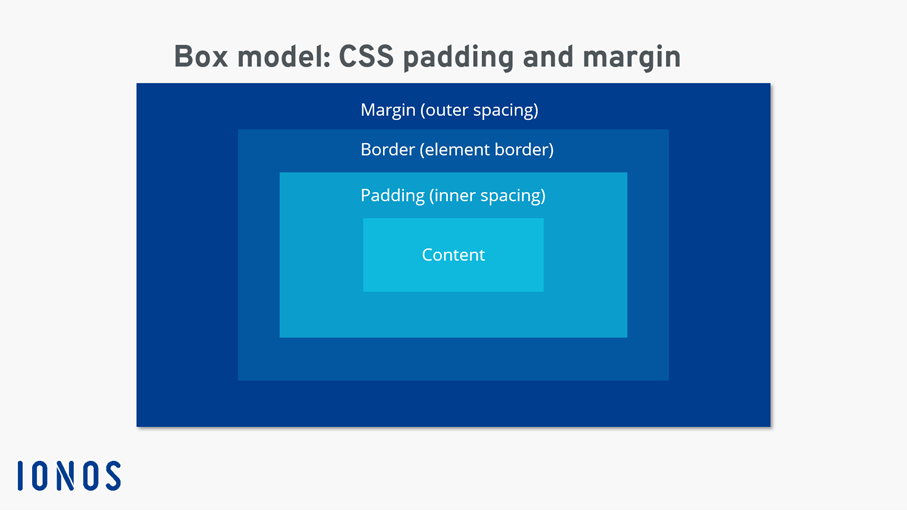
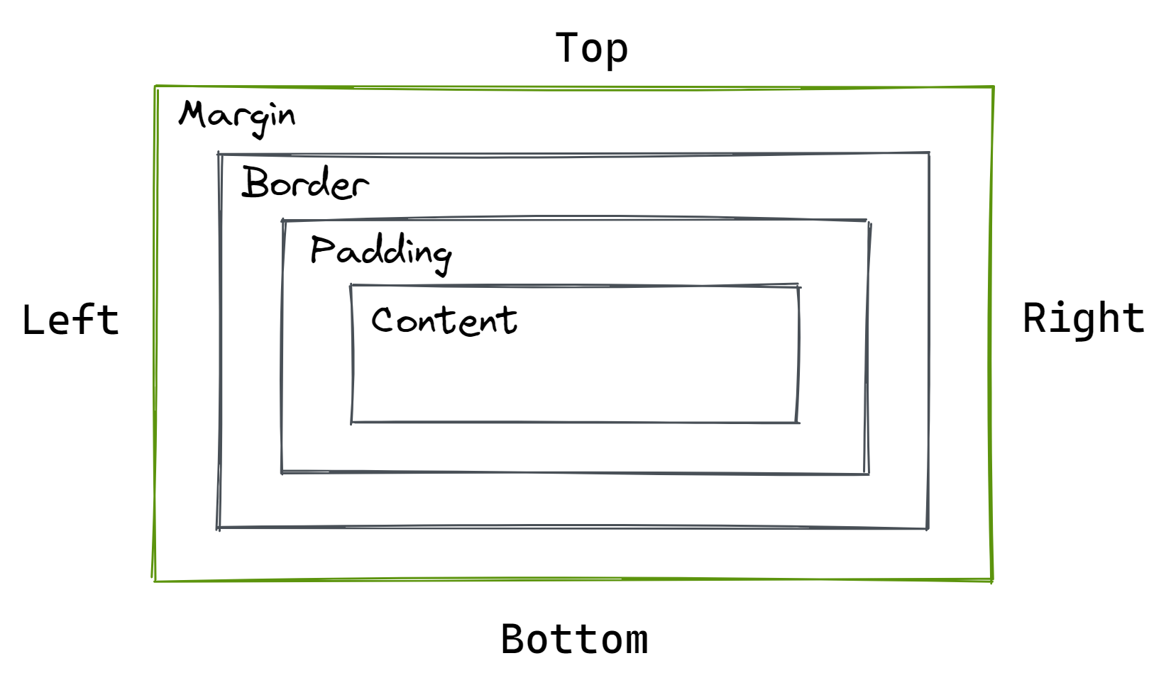
Padding: Internal Space Control
Padding defines the space between the content of an element and its border. It’s crucial for creating visual breathing room and improving readability.
-
padding-top,padding-right,padding-bottom,padding-left: These individual properties allow precise control over padding on each side of an element. You can set a single value (applied to all sides), two values (top/bottom and left/right), three values (top, left/right, bottom), or four values (top, right, bottom, left). -
paddingshorthand property: This simplifies setting padding by allowing you to specify all four sides at once using a single property. For instance,padding: 10px;sets 10 pixels of padding on all sides. -
Percentage values for padding: Padding can also be specified as a percentage of the element’s width. This is useful for responsive design, where padding adjusts dynamically based on the screen size. However, remember this is based on the width, not the height.
-
Units for padding: Padding values can be expressed in various units like pixels (px), ems (em), rems (rem), percentages (%), and more. Choosing the right unit depends on your design needs and responsiveness requirements.
-
Impact on overall element size: Unlike margin, padding adds to the element’s total width and height. This is important to remember when calculating overall element dimensions.
-
Using padding for visual hierarchy: Strategic use of padding can enhance visual hierarchy by creating visual separation between elements and emphasizing particular content areas.
Margin: External Space Control
Margin defines the space outside an element’s border, influencing its position relative to neighboring elements. It’s vital for creating visual separation and controlling the flow of your layout.
-
margin-top,margin-right,margin-bottom,margin-left: Similar to padding, these individual properties allow you to control the margin on each side independently. -
marginshorthand property: Similar to padding, themarginshorthand property lets you set all four margins simultaneously. -
Auto margins: Setting
margin: 0 auto;(on a block-level element) centers the element horizontally. This is a common technique for centering elements within their containers. -
Collapsing margins: Adjacent margins of block-level elements can collapse, meaning the combined margin isn’t the sum of individual margins. This can be unexpected behavior, so understanding this concept is crucial for precise layout control. Using padding in such cases is a way to avoid unexpected margins.
-
Negative margins: These can be used for overlapping elements or creating unique visual effects. They are powerful but require careful consideration to avoid unexpected layout consequences.
-
Margin and positioning: Margins interact significantly with positioning contexts, so understanding the relationship between margins and absolute or relative positioning is vital for complex layouts.
Border: Defining Element Boundaries
The border is a line that surrounds an element, visually separating it from its surroundings. It’s an essential component of the box model, contributing to the visual structure of your design.
-
border-width,border-style,border-color: These three properties define the thickness, style (e.g., solid, dashed, dotted), and color of the border. -
bordershorthand property: This property lets you set all three border properties at once. -
Individual border properties: You can also control each side of the border separately (e.g.,
border-top-width,border-right-style,border-bottom-color). -
Borders and padding/margin: Borders are drawn on top of padding, and margins are applied outside of the border.
-
Responsive borders: Border thickness and styles can be adjusted using media queries for optimal display across different screen sizes.
-
Border-radius: This allows you to create rounded corners, adding a modern touch to your designs.
Width and Height: Defining Content Area Dimensions
Width and height properties control the dimensions of an element’s content area. These are crucial for managing the size and proportions of your page elements.
-
widthproperty: Sets the horizontal dimension of an element’s content area. -
heightproperty: Sets the vertical dimension of an element’s content area. -
Percentage values: Similar to padding and margin, both width and height can be expressed as percentages of the containing element’s dimensions.
-
Auto width/height: Setting
width: auto;allows the element’s width to adjust automatically based on its content. The same applies to theheightproperty. -
Box-sizing property: Understanding the
box-sizingproperty is vital. The default (content-box) includes only the content width/height. Setting it toborder-boxincludes padding and border in the total width/height, which can simplify layout calculations significantly. -
MinMax functions: With CSS’s
min-width,max-width,min-height,max-height, you can define minimum and maximum dimensions for your elements, offering flexible yet controlled sizing. These are helpful for responsive design.
Display Property: Controlling Element Flow
The display property dictates how an element is displayed and how it interacts with other elements on the page.
-
Block-level elements: These elements occupy the full width available to them and stack vertically. Examples include
<div>,<p>,<h1>etc. They have margins that collapse, as we’ve discussed previously. -
Inline elements: These elements only take up as much width as their content requires. They flow horizontally within their container. Examples include
<span>,<a>,<img>. -
Inline-block elements: These combine the properties of both inline and block elements. They take up only the space they need horizontally but allow for vertical margins and padding.
-
Flexbox and Grid: The
display: flex;anddisplay: grid;properties are powerful tools for creating flexible and responsive layouts, providing advanced control over item arrangement and alignment. -
None display: Using
display: none;completely hides the element, making it invisible to the user. -
Understanding context: The display property’s impact is often contextual and depends on the element itself and the parent container.
Conclusion
Mastering CSS box model properties is foundational to creating effective and visually appealing web designs. Understanding the nuances of padding, margin, border, width, height, and the display property, along with the relationships between them, is key to creating robust and responsive websites. The use of shorthand properties and careful consideration of box-sizing will streamline your workflow. Though it requires practice and attention to detail, this knowledge will empower you to build complex and beautifully designed websites. Remember, mastering CSS is an ongoing process of experimentation and learning, but understanding these core concepts will accelerate your journey significantly.
Keywords
CSS Box Model, Padding, Margin, Border, Width, Height, Display
