[
Análisis De Propiedades CSS: margin, padding Y Elementos Relacionados
Executive Summary

This comprehensive guide delves into the crucial CSS properties margin and padding, exploring their functionalities, differences, and practical applications in web development. We’ll dissect their impact on element layout and spacing, clarifying common misconceptions and providing actionable insights for creating clean, efficient, and visually appealing websites. Understanding these properties is fundamental to mastering CSS and building robust, responsive web designs. We’ll also touch upon related concepts like box-sizing and how these properties interact with different display types, equipping you with the knowledge to confidently tackle any layout challenge. This guide is designed to be both informative and practical, empowering you to leverage these CSS properties to their fullest potential.
Introducción
Cascading Style Sheets (CSS) are the cornerstone of web design, responsible for styling and laying out web pages. Among the most fundamental yet often misunderstood CSS properties are margin and padding. These properties dictate the spacing around and within HTML elements, significantly impacting the visual presentation of your website. This detailed guide will clarify their differences, show you how to use them effectively, and explore their interaction with other CSS properties to create polished and professional web designs. Mastering margin and padding is a crucial step in becoming a proficient web developer.
FAQ
-
What’s the difference between
marginandpadding?Margindefines the space outside an element, separating it from neighboring elements.Paddingdefines the space inside an element, separating the content from the element’s border. -
How do I use negative margins? Negative margins can be useful for overlapping elements or creating unique layout effects. However, overuse can lead to unpredictable results. Use them cautiously and understand their implications on the document flow.
-
How does
box-sizingaffectmarginandpadding? Thebox-sizingproperty controls how the width and height of an element are calculated. Setting it toborder-boxincludes padding and border in the total width and height, simplifying layout calculations.
El Propósito de margin
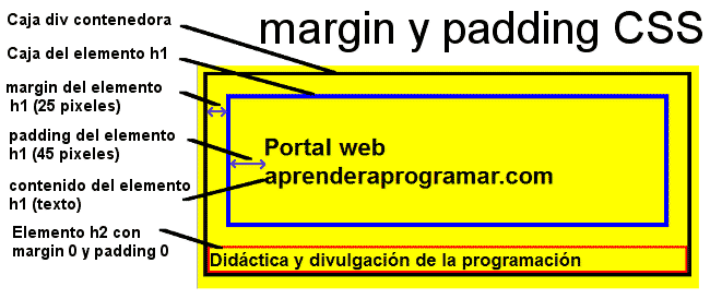
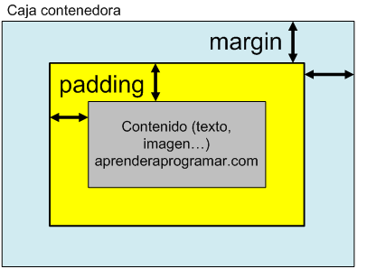
margin defines the space outside an element’s border. It’s the blank space that separates the element from other elements on the page. Understanding margin is crucial for controlling the spacing and layout of your website’s content. Incorrectly using margins can lead to unexpected and frustrating results.
-
margin-top,margin-right,margin-bottom,margin-left: These individual properties control the margin on each respective side of the element. You can set a single value, which applies to all sides, or different values for each side. -
margin: auto;: This is particularly useful for centering block-level elements. When used on a block-level element with a defined width, the horizontal margin will be automatically distributed equally on both sides, effectively centering the element. -
margin-collapse: When adjacent elements have margins, they can sometimes collapse. This means the total margin between the elements might be less than the sum of their individual margins. Understanding margin collapse is key to predictable spacing. -
Negative Margins: While generally avoided due to the potential for unexpected layout issues, negative margins can be used to achieve specific visual effects, like overlapping elements.
La Función de padding
padding defines the space inside an element’s border, between the border and the content. It’s crucial for creating visual breathing room around your content, improving readability and overall design. Unlike margin, padding affects the size of the element itself.
-
padding-top,padding-right,padding-bottom,padding-left: These individual properties control the padding on each respective side of the element, mirroring the margin properties. -
Shorthand
paddingproperty: Similar to margin, you can use shorthand notation to set padding for all four sides simultaneously, or specify different values for each side. -
Padding and Responsive Design: Padding can be used dynamically with media queries to adjust spacing based on screen size, resulting in a more responsive and user-friendly experience.
-
Padding and Accessibility: Appropriate padding around elements improves accessibility, making it easier for users with visual impairments to interact with your website. It gives text and interactive elements sufficient breathing room, improving their usability.
Box-Sizing: Una Pieza Crucial Del Rompecabezas
The box-sizing property influences how the total width and height of an element are calculated. This has a direct impact on how margin and padding behave.
-
box-sizing: content-box;(Default): In this mode, the width and height properties only refer to the content area of the element.paddingandborderare added outside of the specified width and height. -
box-sizing: border-box;: This is highly recommended for most web projects. In this mode, the width and height properties include thepaddingandborder. This significantly simplifies layout calculations and makes responsive design easier to manage. -
Consistency: Using
box-sizing: border-box;consistently throughout your CSS will lead to much more predictable and manageable layouts. -
Debugging: When troubleshooting layout issues, reviewing the
box-sizingproperty is often a crucial step in identifying the source of the problem.
Elementos Display: Bloque vs. En Línea
The display property determines how an element is rendered and how it interacts with other elements on the page. This significantly impacts how margin and padding behave.
-
Block-level elements: These elements take up the full width available, and margins and padding are applied according to their rules.
-
Inline elements: These elements only take up as much width as necessary. Vertical margins and padding are often ignored or behave differently, often relying on line-height.
-
Inline-block elements: These elements combine features of both block-level and inline elements offering a good balance of control. They take up only the width they need, and margins/padding behave more predictably than purely inline elements.
-
Flexbox and Grid: Modern layout techniques like Flexbox and Grid significantly change how
marginandpaddingare handled, offering much greater control and flexibility for complex layouts.
Conclusión
Mastering margin and padding in CSS is paramount for creating well-structured, visually appealing, and user-friendly websites. By understanding their differences, how they interact with other CSS properties, particularly box-sizing and the display property, and how they interact with modern layout techniques like Flexbox and Grid, you can elevate your web design skills significantly. The ability to precisely control spacing around and within elements is critical for ensuring a clean and professional outcome. This detailed analysis serves as a valuable resource, equipping you to confidently handle any layout challenge that may arise. Remember to practice and experiment—the best way to learn is by doing!
Keyword Tags
margin, padding, box-sizing, CSS layout, responsive design
]
