[Css: Comparativa De padding, margin Y Otras Propiedades]
Executive Summary
This comprehensive guide dives deep into the often-confusing world of CSS spacing properties, specifically comparing and contrasting padding and margin. We’ll clarify their functionalities, highlight key differences, and explore related properties like border and box-sizing. Understanding these properties is crucial for crafting clean, responsive, and visually appealing websites. We’ll provide practical examples and clear explanations to ensure you master these fundamental CSS concepts and confidently build beautiful and functional web pages. This guide aims to be the definitive resource for understanding CSS spacing, surpassing other online tutorials through clarity, comprehensiveness, and practical application.
Introduction
Cascading Style Sheets (CSS) are essential for styling web pages. Within CSS, controlling the space around and within elements is critical for visual design. Two properties frequently cause confusion are padding and margin. This article provides a detailed comparison of padding and margin, along with related properties, equipping you with the knowledge to confidently manipulate spacing in your web projects. We’ll demystify these concepts, showing you how to use them effectively to create visually stunning and well-structured websites. Let’s dive in!
FAQ
-
Q: What’s the fundamental difference between
paddingandmargin?A:
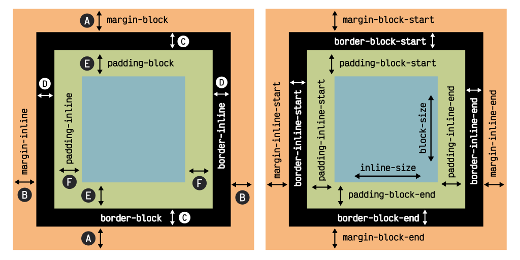
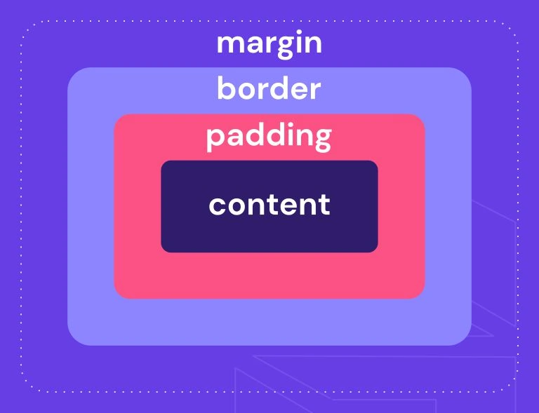
Paddingcontrols the space inside an element’s border, between the content and the border.Margincontrols the space outside an element’s border, between the element and other elements or the browser window. -
Q: How does
box-sizingaffectpaddingandmargin?A: The
box-sizingproperty dictates how the width and height of an element are calculated.box-sizing: content-box(default) includes only the content width/height.box-sizing: border-boxincludes padding and border in the width/height calculation, simplifying layout. -
Q: Can I use negative values for
marginandpadding?A: You can use negative values for
margin, but it’s generally not recommended forpadding. Negative margins can create overlapping elements or unexpected layouts. Negative padding can lead to content overflowing its container. While possible, it’s best to understand the potential consequences before using negative values.
padding: Internal Spacing
Padding adds space between an element’s content and its border. It’s crucial for creating visual breathing room and separating content from the element’s edges. Incorrect use can lead to cluttered layouts.
-
Visual Separation:
paddingensures content doesn’t appear cramped against the element’s boundaries, improving readability and overall aesthetics. For example, adding padding to a paragraph ensures text isn’t hugging the edges of its container. -
Specificity and Control: You can apply
paddingusing shorthand notation (padding: 10px;for all sides) or specify individual values for top, right, bottom, and left (padding: 10px 20px 30px 40px;). This precise control is essential for intricate layouts. -
Impact on Element Size: Remember that with
box-sizing: content-box(the default),paddingincreases the element’s total size. Usingbox-sizing: border-boxnegates this effect, making layout calculations more predictable. -
Responsiveness: Use relative units like
emorremforpaddingto ensure your design adapts well to different screen sizes. Avoid using fixed pixels unless you have a very specific reason. -
Combining with other properties:
paddingworks harmoniously with other CSS properties likeborderandmarginto achieve complex layouts. Understanding their interplay is fundamental for effective web design.
margin: External Spacing
Margin controls the space outside an element’s border, creating separation between the element and its surroundings (other elements or the browser window). Mastering margin is key to arranging elements effectively on a page.
-
Element Separation:
marginprevents elements from colliding, improving readability and visual clarity. For example, using margins between paragraphs prevents text from appearing as one large block. -
Layout Control:
marginis critical for positioning and arranging elements. Understanding different types of margins (top, right, bottom, left) and their behavior is fundamental to flexible layouts. -
Auto Margins: Setting
margin: 0 auto;on a block-level element centers it horizontally within its container, a powerful technique for simple centering. -
Collapsing Margins: Adjacent block-level elements with margins sometimes exhibit “margin collapsing,” where the combined margin is less than the sum of individual margins. Understanding this behavior is important for predictable layouts.
-
Negative Margins: While possible, negative margins can be tricky and should be used cautiously. They can cause elements to overlap, which, while sometimes stylistically useful, can make debugging difficult.
border: The Element’s Outline
The border property defines the line style, width, and color that forms the boundary of an element. While not directly a spacing property, understanding its relationship with padding and margin is crucial.
-
Visual Definition:
borderprovides a clear visual separation between an element and its surroundings. It’s often used for highlighting specific elements or creating visual structure. -
Width and Style: You can control the
border‘s width (border-width), style (border-style– solid, dashed, dotted, etc.), and color (border-color). This allows great flexibility in design. -
Shorthand Notation: Like
paddingandmargin,borderoffers shorthand notation for setting all three properties at once (border: 1px solid black;). -
Combined Usage: The
borderproperty sits directly between thepaddingandmarginproperties. Understanding this arrangement is fundamental for positioning and spacing in your designs. -
Box Model Influence: The
borderis a significant part of the CSS box model. Its width is added to the element’s total width (unlessbox-sizing: border-boxis used).
box-sizing: Redefining the Box Model
The box-sizing property dramatically alters how the width and height of an element are calculated. Understanding this is vital for predictable layouts.
-
content-box(Default): In this mode, the width and height apply only to the content area.paddingandborderare added externally to the content width and height, making layout calculations more complex. -
border-box: This mode includespaddingandborderwithin the specified width and height. This simplifies calculations, making it easier to control the element’s overall size. Many designers prefer this for consistent and predictable layouts. -
Improved Workflow: Using
border-boxstreamlines development by making width and height specifications more intuitive. You declare the total size and the browser handles the inner details. -
Responsiveness Considerations: While
border-boxsimplifies layout, ensuring responsive design still requires careful consideration of units (e.g., usingemorreminstead ofpx). -
Cross-Browser Compatibility:
box-sizing: border-boxenjoys broad support across modern browsers. It’s a best practice to apply this property globally using a CSS reset or normalization stylesheet for consistency.
Conclusion
Mastering padding, margin, border, and box-sizing is essential for any web developer aiming to create visually appealing and well-structured websites. These CSS properties, while seemingly simple, offer incredible control over spacing and layout. By understanding their differences, interactions, and the influence of the box model, you can build responsive and maintainable web pages. This guide provides a strong foundation for navigating the complexities of CSS spacing, empowering you to create more sophisticated and professional designs. Remember to experiment, practice, and consistently refer back to these core concepts as you refine your CSS skills. With diligent practice and a clear understanding of these principles, you can transform your designs from basic to exceptional.
Keyword Tags
padding, margin, border, box-sizing, CSS layout
