[Css: Diferencias Entre padding, margin Y Otras Propiedades]
Executive Summary
This comprehensive guide dives deep into the core differences between CSS’s padding, margin, and other related properties. We’ll clarify the often-confusing distinctions between these fundamental styling attributes, providing practical examples and explanations to solidify your understanding. Whether you’re a seasoned web developer or just starting your CSS journey, this guide will empower you to confidently and effectively use these properties to create visually appealing and well-structured websites. We’ll explore the nuances of each property, their interaction with each other, and demonstrate how to leverage them for precise control over your website’s layout and design. By the end, you’ll have a clear grasp of how to use padding, margin, border, box-sizing, and other related properties to achieve your desired visual effects.

Introduction
Cascading Style Sheets (CSS) are the cornerstone of web design, providing the visual structure and presentation for web pages. Understanding how to effectively manipulate elements on a webpage is crucial, and a key aspect of this involves mastering the use of padding, margin, and other related properties. These properties control the space around and within HTML elements, enabling precise control over layout and appearance. This guide will illuminate the differences between these crucial properties and show you how to utilize them to create stunning web designs.
FAQ
-
Q: What is the fundamental difference between
paddingandmargin?A:
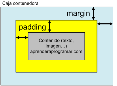
Paddingrefers to the space inside an element’s border, between the content and the border itself.Margin, on the other hand, refers to the space outside an element’s border, between the element and any surrounding elements. Think ofpaddingas the space within a picture frame andmarginas the space on the wall around the picture frame. -
Q: How do
padding,margin, andborderinteract?A: These three properties work together to define an element’s total size and spacing. The element’s content sits inside the
padding, thepaddingis surrounded by theborder, and theborderis surrounded by themargin. Understanding this layered relationship is vital for creating accurate layouts. -
Q: What is
box-sizing, and why is it important?A: The
box-sizingproperty controls how the total width and height of an element are calculated. The default value,content-box, includes only the content and padding in the total width and height. However, by settingbox-sizing: border-box;, you instruct the browser to include padding and border in the total width and height, making layout calculations much more predictable and easier to manage.
Understanding padding
Padding defines the space between an element’s content and its border. It’s crucial for creating visual breathing room around text and other content within an element. Incorrect use of padding can lead to cluttered layouts and a poor user experience.
-
Defining Padding: You can specify padding using shorthand (e.g.,
padding: 10px;for equal padding on all sides) or individually for each side (padding-top,padding-right,padding-bottom,padding-left). -
Units: Padding values can be expressed in various units like pixels (
px), ems (em), rems (rem), percentages (%), and more. Choosing the right unit depends on the context and your desired responsiveness. -
Negative Padding: While less common, negative padding can be used to overlap elements, creating interesting visual effects, but use it cautiously as it can make layouts harder to manage.
-
Impact on Layout: Padding affects the element’s total size (unless
box-sizing: border-box;is used). Understanding this impact is essential for precise layout control. -
Responsiveness: Use relative units like
emorremfor responsive designs, allowing padding to scale with the text size. -
Practical Example:
padding: 20px;adds 20 pixels of padding on all four sides of an element.
Mastering margin
Margin defines the space outside an element’s border, separating it from neighboring elements. Margin is essential for controlling the spacing and positioning of elements within a webpage. Mastering margin is critical for creating clean, well-organized layouts.
-
Defining Margin: Similar to padding, you can define margin using shorthand or individual properties (
margin-top,margin-right,margin-bottom,margin-left). -
Auto Margin: Setting
margin: 0 auto;on a block-level element with a specified width centers it horizontally within its container. This is a powerful technique for horizontal centering. -
Collapsing Margins: Adjacent block-level elements with margins can cause margin collapsing, where the larger of the two margins is used. Understanding margin collapsing is key to avoiding unexpected spacing issues.
-
Negative Margin: Like negative padding, negative margins can be used to overlap elements, but they should be handled carefully to prevent unexpected results.
-
Margin and Positioning: Margins play a significant role in positioning elements, especially when using absolute or relative positioning.
-
Practical Example:
margin: 10px 20px;adds 10 pixels of margin on top and bottom, and 20 pixels on left and right.
Working with border
The border property defines the line around an element. Borders add visual separation and structure to web page elements. While seemingly simple, borders can have a surprisingly big impact on the visual hierarchy and readability of a webpage.
-
Border Properties: You can control the
border‘s width, style (solid, dashed, dotted, etc.), and color. -
Shorthand Notation: The
bordershorthand allows you to set width, style, and color simultaneously (e.g.,border: 2px solid red;). -
Individual Border Sides: You can also define borders individually for each side (e.g.,
border-top,border-right,border-bottom,border-left). -
Border Radius: The
border-radiusproperty allows you to create rounded corners, adding a modern touch to your designs. -
Box Shadow: Combining borders with
box-shadowcan add depth and visual interest to your elements. -
Practical Example:
border: 1px dashed blue;creates a 1-pixel dashed blue border around an element.
The Significance of box-sizing
The box-sizing property is a game-changer when it comes to CSS layout. It controls how the total width and height of an element are calculated, simplifying layout and preventing common sizing discrepancies. Mastering this property makes CSS more predictable and easier to use.
-
Content-Box vs. Border-Box: The default
content-boxmodel only includes the content and padding in the total width/height.border-box, however, includes padding and border, making layout significantly more intuitive. -
Consistent Sizing:
box-sizing: border-box;ensures consistent element sizing, regardless of padding and border values, leading to more predictable and easier-to-manage layouts. -
Improved Workflow: Using
border-boxgreatly simplifies the process of designing and building web layouts, saving time and effort. -
Browser Compatibility:
box-sizingis widely supported by modern browsers, making it safe and effective to use in most projects. -
Practical Example:
box-sizing: border-box;applied to all elements means that the specified width and height already include padding and border.
Understanding Other Relevant Properties
Beyond padding, margin, border, and box-sizing, several other CSS properties influence an element’s spacing and layout. Understanding these complementary properties further enhances your ability to craft precise and visually appealing websites.
-
outline: Similar toborder, but sits outside the border and is often used for focus indicators. It’s unaffected bybox-sizing. -
overflow: Controls how content overflowing its container is handled (e.g.,visible,hidden,scroll,auto). -
visibility: Determines whether an element is visible or not (visible,hidden,collapse). -
display: Thedisplayproperty fundamentally influences how an element is rendered (e.g.,block,inline,inline-block,flex,grid). Its interaction with margins and padding is crucial to understand. -
position: Thepositionproperty dictates how an element is positioned relative to its container and other elements (e.g.,static,relative,absolute,fixed,sticky).
Conclusion
Understanding the nuanced differences between padding, margin, border, box-sizing, and other related CSS properties is paramount to creating effective and visually appealing web designs. By mastering these fundamental concepts, you’ll be able to design clean, organized, and responsive websites. Remember the key distinctions: padding is inside the border, margin is outside, and box-sizing drastically simplifies layout by influencing how total size is calculated. Through deliberate and informed usage of these properties, you can elevate your web design skills and produce professional-quality websites that are both functional and aesthetically pleasing. Practice consistently, experiment with different combinations, and soon you’ll be confidently crafting sophisticated web layouts with ease.
Keywords
padding, margin, border, box-sizing, CSS layout
