[Css: Padding, Margin Y Border: Guía Completa Con Ejemplos]
Executive Summary
This comprehensive guide dives deep into the fundamental CSS properties: padding, margin, and border. We’ll explore their individual functions, how they interact with each other, and crucially, how to effectively use them to create visually appealing and well-structured web pages. Through clear explanations and practical examples, you’ll gain a strong understanding of these essential CSS concepts, enabling you to build more sophisticated and professional websites. We’ll cover common pitfalls and provide best practices to ensure your layouts are both aesthetically pleasing and semantically correct. Prepare to master the art of spacing and styling your HTML elements!
Introduction
Understanding padding, margin, and border is essential for any aspiring web developer. These CSS properties control the space around and within HTML elements, directly impacting the layout and visual appeal of your website. This guide will break down each property, showing you how they work individually and in conjunction, providing you with the knowledge to confidently style your web pages. Mastering these concepts is a crucial step towards building professional and user-friendly websites. Let’s begin!
FAQ
-
Q: What’s the difference between padding and margin?
A: Padding refers to the space inside an element’s border, affecting the space between the element’s content and its border. Margin, on the other hand, refers to the space outside an element’s border, affecting the space between the element and surrounding elements.
-
Q: Can I use padding and margin with percentages?
A: Yes, you can use percentages for both padding and margin. However, keep in mind that percentage values are relative to the width of the containing element for horizontal padding/margin and relative to the height of the containing element for vertical padding/margin. Using percentages can sometimes lead to unexpected results if not carefully considered.
-
Q: How do I apply padding and margin to all four sides of an element at once?
A: You can use shorthand notation! For instance,
padding: 10px;applies 10 pixels of padding to all four sides (top, right, bottom, left). Similarly,margin: 20px;will apply 20 pixels of margin to all sides. You can also specify individual values:padding: 10px 20px 30px 40px;(top, right, bottom, left).
Understanding Padding
Padding defines the space between the content of an element and its border. It’s like the internal breathing room within an element. Think of it as the cushion between the content and the element’s outer shell.
-
Applying Padding: Use the
paddingproperty followed by a value (e.g.,padding: 10px;,padding-top: 5px;). You can specify padding for individual sides (top, right, bottom, left) or use shorthand notation for all four sides at once. -
Padding Units: You can use various units for padding, such as pixels (px), ems (em), rems (rem), percentages (%), and more. Choose units that best suit your design’s responsiveness and consistency.
-
Box Model Impact: Padding is part of the element’s content box. This means it’s included in the element’s total width and height. Remember the box model when calculating the overall size of your elements.
-
Padding Collapse: Adjacent padding values between elements sometimes collapse. Understanding this behavior is crucial to avoid unexpected results. Consider using margins instead if consistent spacing is crucial between multiple elements.
-
Practical Example: Use padding to create internal spacing within a button or to give text some breathing room within a container.
-
Common Mistakes: Forgetting that padding affects the overall size of the element and using inappropriate units causing inconsistencies in responsiveness.
Mastering Margin
Margin defines the space outside an element’s border, separating it from neighboring elements. It’s the element’s personal space, controlling how much distance it keeps from its surroundings.
-
Applying Margin: Similar to padding, use the
marginproperty followed by a value (e.g.,margin: 20px;,margin-bottom: 10px;). Shorthand notation is also available for concisely setting margin values for all four sides. -
Margin Units: You can use the same units for margin as for padding: pixels (px), ems (em), rems (rem), percentages (%), etc.
-
Auto Margin: Setting
margin: 0 auto;centers a block-level element horizontally within its parent container. -
Margin Collapse: Adjacent margin values between elements can sometimes collapse. This can lead to unexpected spacing if not considered properly.
-
Practical Example: Use margin to create space between paragraphs, images, or other elements on your page.
-
Common Mistakes: Overlooking margin collapse and using overly large margin values which can negatively impact the visual layout of your page.
Delving into Borders
Borders form the outer boundary of an element, creating a visual separation and enhancement. They add definition and style to your elements.
-
Applying Borders: Use the
borderproperty, specifying thewidth,style, andcolor(e.g.,border: 1px solid black;). You can also style individual borders (top, right, bottom, left) separately. -
Border Styles: A variety of styles are available, including
solid,dashed,dotted,double,groove,ridge,inset, andoutset. -
Border Width Units: Units for border width include pixels (px), points (pt), ems (em), percentages (%), etc.
-
Border Radius: Round off corners using the
border-radiusproperty. This is a fantastic way to enhance the visual appeal of elements like buttons or images. Experiment with different radius values to achieve different levels of curvature. -
Practical Example: Use borders to create visual separation between table cells, highlight important sections of text, or add a visual style to buttons.
-
Common Mistakes: Overusing borders resulting in a cluttered and visually overwhelming design and forgetting border-radius to enhance the look and feel of elements.
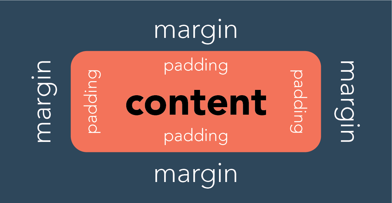
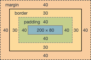
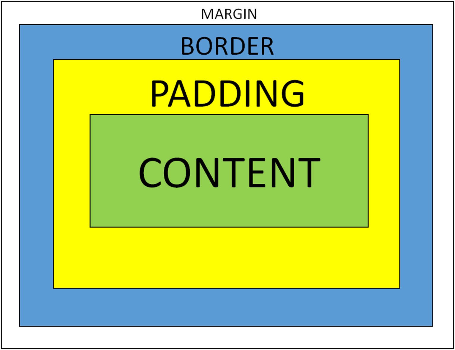
Understanding the Box Model
The box model is a fundamental concept in CSS that describes how an element is structured. Understanding this is crucial to accurately controlling the space around and within elements. The box model comprises of:
-
Content: This is the actual content of the element (text, images, etc.).
-
Padding: The space between the content and the border.
-
Border: The line that surrounds the padding and content.
-
Margin: The space between the border and other elements.
Understanding the interplay between these four components is key to accurate layout design. Different browsers might have different defaults (e.g., including padding and border in the total width/height). Always remember to check and account for this behavior. It’s best practice to use the box-sizing property to control the total width/height calculation, ensuring consistency across different browsers.
Conclusion
Mastering CSS padding, margin, and border is a crucial step in building professional and visually appealing websites. By understanding their individual functions and how they interact, you’ll gain the control needed to create precise and effective layouts. Remember the key concepts: padding for internal spacing, margin for external spacing, and borders for visual definition. Through consistent practice and experimentation, you’ll build a strong foundation for crafting exceptional web designs, ensuring your web pages are not only functional but also stunning. Don’t underestimate the power of careful spacing and visually pleasing layouts to create a successful user experience!
Keyword Tags
CSS padding, CSS margin, CSS border, CSS box model, web design
