[Css: Padding, Margin Y Border: Una Comparativa Completa]
Executive Summary
This comprehensive guide delves into the core differences between CSS padding, margin, and border properties. We’ll explore their functionalities, practical applications, and how to effectively utilize them to create clean, well-structured, and visually appealing websites. Understanding these fundamental CSS attributes is crucial for any aspiring or experienced web developer aiming to achieve precise control over the layout and visual presentation of their web pages. We will clarify common points of confusion and provide practical examples to solidify your understanding. By the end, you’ll be confident in choosing the correct property for every design challenge.
Introduction
Cascading Style Sheets (CSS) are fundamental to web design, enabling developers to control the visual presentation of web pages. Among the most crucial CSS properties are padding, margin, and border. While often confused, these properties serve distinct purposes in defining the space around and within HTML elements. This guide aims to provide a clear understanding of each, highlighting their differences and demonstrating their practical applications through clear examples and explanations. Mastering these properties is key to creating clean, well-structured, and visually appealing websites.
Frequently Asked Questions (FAQ)
-
Q: What’s the main difference between padding and margin?
-
A:
Paddingadds space inside an element’s border, affecting the space between the element’s content and its border.Margin, on the other hand, adds space outside the element’s border, creating space between the element and its neighboring elements or the browser window. -
Q: Can I use negative margins?
-
A: Yes, you can use negative margins to overlap elements or create interesting layout effects. However, overuse can lead to unexpected and difficult-to-debug issues, so use them cautiously and deliberately.
-
Q: How do borders affect the layout?
-
A:
Bordersare added on top of the padding, thus increasing the overall space an element occupies on the page. Understanding this layering is essential for accurate layout predictions.
Understanding Padding
Padding controls the space between an element’s content and its border. It’s essentially the internal spacing within an element. Think of it as the “breathing room” for the content inside a box.
-
Specificity: Padding can be applied to all four sides (top, right, bottom, left) individually or using shorthand notation.
padding: 10px;applies 10 pixels of padding to all sides.padding: 10px 20px 30px 40px;applies padding to top, right, bottom, and left respectively. -
Units: Padding can be expressed in various units like pixels (px), ems, rems, percentages (%), and more. Choosing the right unit depends on your desired responsiveness and layout behavior.
-
Box Model Impact: Padding affects the element’s total size; it’s included within the element’s overall dimensions.
-
Visual Effect: Padding creates space around your content, making it visually more comfortable to read and interact with. It helps to prevent text from appearing cramped or cluttered.
-
Accessibility: Appropriate padding improves accessibility by ensuring sufficient spacing between text and other interactive elements.
-
Responsiveness: Using relative units like
emorremmakes your padding responsive to different screen sizes.
Mastering Margins
Margins define the space outside an element’s border, influencing the spacing between the element and its surroundings. It’s the external space around a box.
-
Functionality: Margins control the distance between elements. They create separation and structure within a webpage’s layout.
-
Shorthand Notation: Similar to padding, margins can be defined using shorthand notation, specifying values for top, right, bottom, and left margins.
-
Collapsing Margins: Adjacent elements with margins sometimes exhibit “collapsing margins,” where the larger margin is applied. Understanding this behavior is crucial for precise layout control.
-
Negative Margins: While potentially useful for overlapping elements, negative margins require careful consideration and can complicate layout debugging.
-
Auto Margins: Setting a margin to
autocenters the element horizontally (if width is specified) or vertically. -
Use Cases: Margins are fundamental in creating layouts, aligning elements, and spacing content appropriately.
CSS Borders: Defining Boundaries
Borders are visual lines around an element. They provide visual separation and structure to content on your page.
-
Style: Borders can be styled in various ways, including solid, dashed, dotted, double, groove, ridge, inset, and outset.
-
Width: Border width is adjustable, ranging from thin lines to thicker visual separators.
-
Color: The border color can be specified with hex codes, RGB values, or named colors.
-
Shorthand: Similar to padding and margins, you can use shorthand notation to set all border properties at once.
-
Rounded Corners: Use
border-radiusto create rounded corners for softer visual effects. This is commonly used for buttons and image elements. -
Box-Shadow: Add depth and visual interest to your elements using
box-shadowwhich can be used in conjunction with borders.
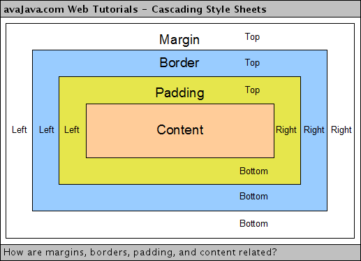
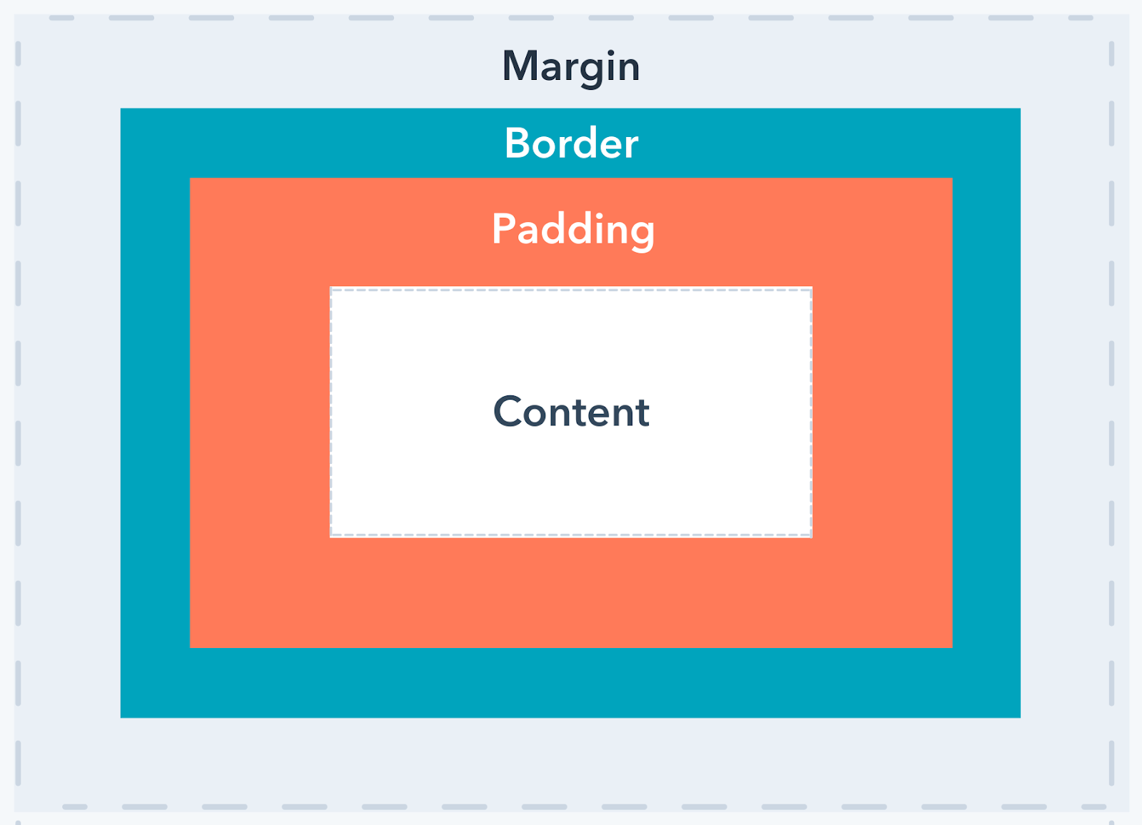
Exploring the CSS Box Model
Understanding the CSS Box Model is paramount for properly using padding, margin, and border. The Box Model defines the structure of an element, encompassing content, padding, border, and margin.
-
Content: The actual text, images, or other elements within the HTML element.
-
Padding: The space between the content and the border.
-
Border: The line drawn around the content and padding.
-
Margin: The space between the border and other elements.
-
Order: Content is inside, then padding, then border, finally, margin. This is the sequence of application and how it affects the total space an element occupies on the page.
-
Practical Implications: Understanding the order is key to achieving precise layout control and avoiding unexpected visual results.
Conclusion
Mastering padding, margin, and border is an essential skill for any web developer. These three CSS properties are fundamental tools for crafting well-structured, visually appealing, and user-friendly web pages. By understanding their distinct functions, how they interact within the CSS Box Model, and the various ways to apply them, you can gain fine-grained control over the layout and presentation of your website. Remember to practice consistently and experiment with different styles and units to strengthen your understanding and develop your own unique design style. Careful consideration of these attributes will lead to cleaner, more intuitive designs that effectively communicate your content. Always remember to test your styles across various browsers and devices to ensure consistent rendering.
Keywords
CSS Padding, CSS Margin, CSS Border, CSS Box Model, Web Design Layout
